
Pure CSS Navbar, Flex and Grids
- Glenn Prince
- Web design
- December 3, 2019
Table of Contents
This week I started on the cleaning up of my site. One of the main reasons I am doing this, apart from refreshing the site a bit, is to learn and optimize the HTML and CSS. My current site uses Bootstrap under the covers, which has been fine and will probably be fine if I wanted continue down this path. However I like the idea of crafting something just for my needs and learning new things.
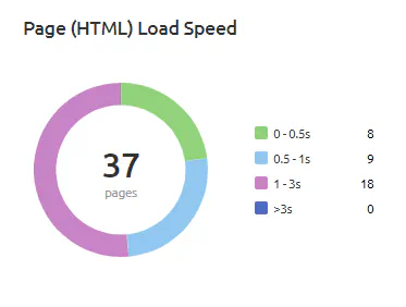
The other little experiment will be to see if I can improve the site experience and load times. At the moment my site is pretty good, with all pages loading under three seconds. But, one of the things I want to try is to remove most, if not all, of the Javascript from my site. Part of the attraction of static site generators is everything is effectively static, Javascript feels like cheating :-P.
The Navbar
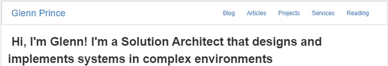
My first step was to create a Navbar to make navigation within the site fairly simple. I initially set this up with a plain static Navbar used for the wide or desktop version in CSS. The CSS for that looks like this:
.navbar {
    border-bottom: 1px solid rgba(0, 0, 0, 0.2);
    background: #fff;
    padding-bottom: 0.8em;
    position: fixed;
    top: 0;
    width: 100%;
    z-index: 1050;
}

.nav-content {
    list-style-type: none;
    display:none;
}

.nav-content li {
    text-align: center;
    margin: 1em auto;
}

.logo {
    display: inline-block;
    font-size: 22px;
    margin-top: 0.5em;
    margin-left: 1em;
}

@media screen and (min-width: 768px) {
    .navbar {
        display: flex;
        justify-content: space-between;
        padding-bottom: 0;
        height: 4em;
        align-items: center;
    }

    .nav-content {
        display: flex;
        margin-right: 1em;
        justify-content: flex-end;
    }

    .nav-content ul {
        display: flex;
        list-style-type: none;
        margin-right: 1em;
    }

    .nav-content li {
        margin: 1em;
    }

    .logo {
        margin-top: 0;
    }
}
and the HTML (with Hugo variables) for the Navbar looks like this:
<header id="header">
    <!-- Static navbar -->
    <nav class="navbar">
        <a href="/" class="logo">{{ .Site.Params.logoText }}</a>
        <div id="nav-content" class="nav-content">
            <ul>
                {{ range .Site.Menus.main }}
                <li>
                    <a href="{{ .URL }}">{{ .Name }}</a>
                </li>
                {{end}}
            </ul>
        </div>
    </nav>
</header>
This is a pretty standard way to stick a Navbar to the top of the site which gives a good starting point.
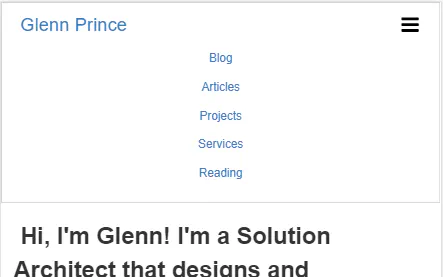
For the mobile version of the site we need a collapsible menu so that we can fit the menu into a smaller screen. To do this I am using a technique that uses a hidden checkbox with a icon spanned across it that sets the display property off and on when checked. The CSS for this technique required the following:
.navbar-toggle {
    position: absolute;
    top: 0.6em;
    right: 1em;
    cursor: pointer;
    font-size: 24px;
}

.logo {
    display: inline-block;
    font-size: 22px;
    margin-top: 0.5em;
    margin-left: 1em;
}

 #navbar-toggle:checked ~ .nav-content {
    display:block;
 }

#navbar-toggle {
  display:none;
}

@media screen and (min-width: 768px) {
    .logo {
        margin-top: 0;
    }

    .navbar-toggle {
        display: none;
    }
}
And the final HTML looks like this:
<header id="header">
    <!-- Static navbar -->
    <nav class="navbar">
        <label for="navbar-toggle" class="navbar-toggle">
            <span class="icon icon-navtoggle">
                <svg class="icon icon-navtoggle"><use xlink:href="/images/site-symbols.svg#icon-navtoggle"></use></svg>
            </span>
        </label>
        <input type="checkbox" id="navbar-toggle">

        <a href="/" class="logo">{{ .Site.Params.logoText }}</a>
        <div id="nav-content" class="nav-content">
            <ul>
                {{ range .Site.Menus.main }}
                <li>
                    <a href="{{ .URL }}">{{ .Name }}</a>
                </li>
                {{end}}
            </ul>
        </div>
    </nav>
</header>
This ended up taking quite a while but the end result is really good, and I can’t tell the difference between this and the Javascript driven version of the same thing.
Flex and Grid layouts
The other thing I have been playing around with this week is using CSS grids and Flex box to layout the site.
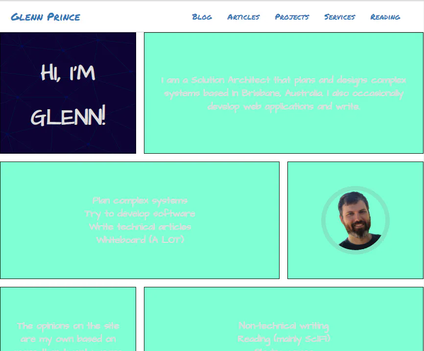
Ignoring the garish placeholder colours, the theme I am giving my site is more of a scratch pad / always unfinished feel. PArt of that is splitting up the standard website with a bit more of an asymmetrical grid. For the desktop site, I am using this broken grid which then reverts to a simple one after the other grid for mobile.
To set this up I am using media queries to change the grid layouts, here is the CSS:
.grid-container {
    display: grid;
    grid-template-columns: 1fr;
    grid-template-rows: 1fr;
    grid-gap: 1em 1em;
  }

@media screen and (min-width: 768px) {
    .grid-container {
        display: grid;
        grid-template-columns: 1fr 1fr 1fr;
        grid-template-rows: 1fr;
        grid-gap: 1em 1em;
      }
}
This has a grid with three columns at the large size (with one segment spanning two columns) and a single column on mobile.
Next Steps
The next step for next week is to continue the layout for the main section then theme it.